* New - A more powerful, built in search engine.
* New - A 'Contact' button (Can I Help) on the side so you can email me direct from the page with any problems, queries, or questions.
* New - Larger, easier to read posts
P.S some great new 'exclusive type' posts coming sometime over the weekend...

9 comments:
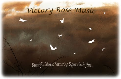
Love the birds and background, very nice. Now that the top image is no longer centered, it should be resized smaller to fit over the left column, or made bigger to span both columns. I vote for cropping it so it's wider yet skinnier and spans the width of both columns. Keep up the good work.
Dear Jon,
whatever the layout, I´ll love and treasure your website. Lighter is nice, but -if you really want to hear my humble opinion- I associate the website with Sigur Ros, and everything to do with Sigur Ros (and Iceland) in my eyes should be blue (the sea) and/or green (the land) and/or white (the ice) and/or insanely colourful (see Jonsi). BTW, what happened to the Brussel´s vid of Jonsi. It disappeared whithout any further comment :-(((
I love it. The lighter colors are more welcoming and the birds are a great touch. Thank you so much for everything.
Thanks for your treasured thoughts, idea's & encouragement.
@ Jamilah - some things I can't 'publicly' post but.... you can find my email on the blog if you have any further questions.... :)
New layout is a pleasant surprise! A welcome change... well done :)
If you like it, that's all that matters. Be you, bro. Your site is the best goddam Sigur Ros archive.
It's really great, but i would love to see more smáskífa birds! ;)
All good stuff. Echoing what others have said, if you like it, that's the main thing. Keep up the excellent - it's very much appreciated, more than you probably know. If you need any more support, all you need to do is ask. Cheers.
Post a Comment